Tuesday, 26 May 2015

Finished Posters


Below here I have my finished posters!  A few things have changed since my last post about them so I will explain.  The problems I had with these designs first off is the background stars, which aren't actually that visible in these screenshots.  A filter in PS simply wasn't working.  This was Filter > Noise.  This is how I made my starey background and then adjusting the lighting levels.  Every time I did this the stars went back to the original image which was thousands of small dots not just a few.  Because of this I had to go in individually and do them myself with different brightnesses which took a while.  

I have created some clouds, again not very visible but just below the moon in every poster.  For this I used various filters and played around with opacity levels. I have included lightning in every poster except for one.  I want to make a statement by using something thats considered very powerful and heroic and to me, this symbolises it perfectly.  I also felt that empty space in this poster series was important because I found when I added elements around the triangular shape, the same impact of boldness and importance wasn't created.  Free space does the job for this.

Lastly, I added the typical information needed on any promotion poster.  The show which is '#ABGT150' the venue which is 'AllPhone Arena' and the date which is '26/9'.

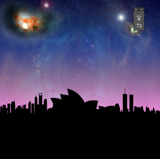
As for the bottom banner, I wanted this to be different in every poster, or at least most of them.  I have the first poster as photograph which I have manipulated, the second as the Sydney scenery made in vectors in Illustrator, the third is the Opra house but copied and made into a sort of symmetric banner.  Because of it's shape I think this looks pretty good.  The last is the Sydney vectors again.


So above here in my first poster I gathered an image of Sydney harbour and took away all the colour, went in individually with the wand toool to take any white so the illusion of the background appears through the bridge for example.  I used lighting levels to make the Opra house light enough that its still noticeable without being too dark.  I have added in the bolt with a flare off the top of it for it to appear as if it is striking the bridge to create an impact.  The star clusters are coloured orange and green with highlighted affects.  


In my second poster, I have played around with the hue/ situation levels to make the star clusters turn a different colour.  This is to match the gradient accordingly.  Orange and red would stick out un wantingly and collide with the other colours making this unpractical. I have added blurs to pretty much every element in these posters for a more softer touch so objects don't appear too hard upon each other.  This way, the colour blends in more as well giving that spooky type appearance.  The clouds aren't as visible in this poster.  I have added the lightning strikes to either side of the shape.  As to give the appearance that perhaps it has wings so It could look as if its in mid air or flight.  Or simply making that hard statement of power, however you want to look at it.


 I have added a super bright star cluster to the middle of the poster to enlighten the image.  It contours the edge of the shape.  The banner is the Opra house.   Clouds are actually more visible here. 


I really like my choice of gradient here with the red.  I have re-used my lightning at the top of my poster for the added effect.  I have decreased the opacity and added some more bolts to the left hand side going off the page.  

Final Video Analysis

These are the screen shots of my final video.  I have included what I consider to be the highlights of my video and the most important scenes.  There are a lot of cut scenes from shows so It was difficult to get them all as there is many.  My aim in this video was obviously to promote, that was my brief.  I feel I have done that but added passion, emotion and desire too which was my plan.  The reason for this as Ive said before is to replicate what it's like as fan to be there and since this is a huge milestone show, It only seemed appropriate.  There is a point in the video where the video almost 'cuts' from the up beat music to a slower part where the passionate part comes in.  The track used within this part is Above and Beyond - Peace Of Mind.  It's the slower more enlightening part of the song and I think it fits perfectly.    


The opening scene, The guys from behind.


On this scene theres a voice over that says 'Welcome to Group Therapy, with Above and Beyond'.  The opening to each of their radio shows.  I like how the lights illuminate the crowd.


The members of the group.


The fans, all hands up I think this looks great.


The fans and stage with the bright lights.


The scene above is where the scene cuts to the more emotional part of the show.  Shows a girl with her arms held out. 


Above is the slow motion part of a girl 'lost in the music'


An act of togetherness, bringing people together.


The fans.


Emotion and desire!


As you may have seen from a previous post, within their shows, Above and Beyond like to type up on the screen and thank the fans for making this possible or anything really to communicate with the fans.  This is sort of iconic for them.  One of the most well known ones is 'Life Is Made Of Small Moments Like This'.  Below here are a few more example of their messages.  From these you can see why these people above made this poster and why I have included it in My video.  


This is where the 'Thank You For The Small Moments' poster came from.  Thanking them.


Another awesome message.


A london show.


'The Future really Is In Your hands'.  I hope you can see why they use these messages.


This is a celebration.  Confetti is used. 


Another shot of a die hard fan.


The same girl as a shot above enjoying herself.  Wearing the classic Above and Beyond colours in ribbons.


This information is provided where the show is.


The venue of the show.


The date of the show.


When tickets are available.


Same shot as one mentioned up above.


The closing scene, the Group Therapy logo.


Monday, 25 May 2015

Video Story Board

Below here is my rough Storyboard for my video.  The first block is the Dj deck with the fans cheering.  At this point you will hear Welcome to Group Therapy with Above and Beyond.  That is the opening to every radio show.  The second is a follow up of the fans and lights.  Sine there is going to be a lot of cutting and editing with this video, I plan on cutting on each scene maybe even for a split second, cutting to another to create atmosphere with the lights and music.  After showing the lights and shows to represent what an un-forgetable experience it will be, I want to cut to the emotion and desire sort of side.  I am changing the track here and putting together shots of fans hugging, in tears.  This is because this will portray what their music actually does to you and why you should go.  I thought about having white text to match the text they already use at their shows saying 'Desire' or 'emotion' on each clip but thought this may be too much.  After, the music will change again and flow to scenes where text is displayed saying 'Sydney' then the date of the show and the venue which is Allphones Arena.  Ive gathered that this video will be longer than anticipated, at around 2 minutes to 2 and a half minutes.    


Sunday, 24 May 2015

Video Research

I was beginning to look at videos that promote something and try to find a trend within them which I can then take into my own work.  I am not very experienced in video so I wanted to have a go at creating some sort of feeling.  The feeling I want to express is emotion and passion, whilst trying to get people to attend the show.


This video above is a Grammys promo video.  They use special effects and colour to to make an odd but very interesting and cool effect.  I won't be able to replicate something on this scale as I do not have the knowledge and I'm sure something like this is created on some piece of software that I do not know or even have.  All the same the effect is great.  This reminds me of when we went to see William Lathem in Brighton as his work was very similar.


Friday, 22 May 2015

Alice in Wonderland - Visual Effects Highlights

This post is slightly off topic because I found it within the suggestions box of Youtube but its about Visual effects.  I think be creating many visual effects within my video except for made brighter colours or playing around with text elements.  This video is interesting though because he describes different scenes of Alice in Wonderland and how CG is used to create them and pull off different scene stunts.


Video re search/ progress

After re searching video interviews with the Above and Beyond members and what they want their fans to think of them and their music, I really want to show this through my video promo.  I know a promo video shouldn't be too long however, I may need longer than a minute and a half to complete it.  Here are some screenshots of previous land mark celebration shows that Above and Beyond have done.

Sydney Harbour, I want in some way to include this image along side the partying.


Above and Beyond show


The members themselves, I feel it's important to include these guys as well.


Passion.  I want to include the emotions that these Djs can create.  They consider the trance scene to be a skin tingling type of music and I want to show the fans in this way.


Passion and emotion.  Again the coming together of people, making them connected.  Maybe people that don't even know each other.  I feel this is important this is what I want to show mostly.  This is a promo video but this is powerful.


During their shows they like to 'come together' with the fans and have a message saying 'Life is made of small moments like this'.  This is a shot of some fans showing their commitment and love towards them.


All about the people that create this music.


Coming together.


Desire and passion.


Enjoyment in the moment.


Most of all this upcoming show is about celebration.  This shot is from ABGT100 set in New York.


Thanking the fans for making this possible.


Sydney harbour bridge.  I have to remember this is just as much about Sydney as it is about showing what a performance Above and Beyond make.  The aim of this video is to promote the up coming show in september.

Poster Analysis

I am really happy with my posters so far considering my lack of knowledge in photoshop.  I am continuing working on these also whilst planning my video.  Here are some shots of my posters and why I have made certain decisions:


Above here is my first poster in the series.  I love the lit up, explosion like feel to the sky to give it some atmosphere and like Ive said before I wanted this theme because I want to create an illusion or a feel that Above and Beyond has landed in Sydney and I think the shape behind helps with that.  As for the remaining scenery I am still un sure on where to place certain elements, if they should be included and what colours they should be.


The Above and Beyond logo.  This is something I cannot change even if I wanted but I have to decide on a colour.  This logo will be sat in front of the arrow like shape on each poster keeping the theme.


I thought about placing the logo over the top of one of the nebula like star clusters which I think looks pretty cool however.  Maybe once the logo is coloured, elements wouldn't stand out as much as I hoped or there would just be too much going on in one place.  I also thought about just leaving the stroke on for the logo (made in illustrator and copied into Photoshop as a pixel element) but I felt the attention needs to be centred straight on the logo as one of the first things you see and this wouldn't do that.


I played around with the city scape that I made in Illustrator and made it larger, increased the size higher and lower and I couldn't decide on what to do.  I conducted some research into posters with banners however, most of these were either along the top or the middle.  I could not take this design decision into my own work because of my plan and what I wanted it to look like.


Above here is a snap of different colours being used within the logo.  I looked into 80s themes, electronic sort of bright vibrant colours and found that I could add a gradient to the stroke and the fill without them contrasting.  The original logo colour is just plain black, this would not stand out within my designs.  I used different tones from the same colour Hex value or there about and played around with what looked best.


I really like this logo above here with these gradients that I designed on.  I like the way the red stroke sort of seeps into the blue.  For the fill, I have a light blue, dark blue and white.  I feel this works.


I have added a moon in the left corner and again, added some flares in parts of the poster and played around with the blending modes to gather colour rich content.  For the moon, I made a white circle on a new layer, added a 3px gaussian bur to it so elements don't look too hardened up on one another.  I actually did this with a lot of my elements.  I think added a layer mask to it and took the eraser tool whilst the blending mode was on either overlay or screen to lighting take parts of the moon out.  This softens up the design and creates an illusion of a cloud affect perhaps.


As you can see from this shot, the logo is filled with a blue sort of mucky colour.  To achieve this, I selected the inside of the logo (whilst I had a dark blue foreground colour and a black background colour) and went to filter, render, clouds.  This affect came up and I was really pleased with it.  One problem on this design as it stands is the faint line beneath the shape.  I still don't know whats causing this so I will figure it out later.  As you can see I have lowered the city scape but I still think this needs to be bigger, I just can't find the right size to actually say, this is Sydney because at the moment the logo is the first element you look at followed by the sky I say.  I want it to be Logo, then the sky line as this is all about Above and Beyond and Sydney.