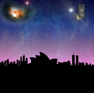
Above here is my first poster in the series. I love the lit up, explosion like feel to the sky to give it some atmosphere and like Ive said before I wanted this theme because I want to create an illusion or a feel that Above and Beyond has landed in Sydney and I think the shape behind helps with that. As for the remaining scenery I am still un sure on where to place certain elements, if they should be included and what colours they should be.
The Above and Beyond logo. This is something I cannot change even if I wanted but I have to decide on a colour. This logo will be sat in front of the arrow like shape on each poster keeping the theme.
I thought about placing the logo over the top of one of the nebula like star clusters which I think looks pretty cool however. Maybe once the logo is coloured, elements wouldn't stand out as much as I hoped or there would just be too much going on in one place. I also thought about just leaving the stroke on for the logo (made in illustrator and copied into Photoshop as a pixel element) but I felt the attention needs to be centred straight on the logo as one of the first things you see and this wouldn't do that.
I played around with the city scape that I made in Illustrator and made it larger, increased the size higher and lower and I couldn't decide on what to do. I conducted some research into posters with banners however, most of these were either along the top or the middle. I could not take this design decision into my own work because of my plan and what I wanted it to look like.
Above here is a snap of different colours being used within the logo. I looked into 80s themes, electronic sort of bright vibrant colours and found that I could add a gradient to the stroke and the fill without them contrasting. The original logo colour is just plain black, this would not stand out within my designs. I used different tones from the same colour Hex value or there about and played around with what looked best.
I really like this logo above here with these gradients that I designed on. I like the way the red stroke sort of seeps into the blue. For the fill, I have a light blue, dark blue and white. I feel this works.
I have added a moon in the left corner and again, added some flares in parts of the poster and played around with the blending modes to gather colour rich content. For the moon, I made a white circle on a new layer, added a 3px gaussian bur to it so elements don't look too hardened up on one another. I actually did this with a lot of my elements. I think added a layer mask to it and took the eraser tool whilst the blending mode was on either overlay or screen to lighting take parts of the moon out. This softens up the design and creates an illusion of a cloud affect perhaps.
As you can see from this shot, the logo is filled with a blue sort of mucky colour. To achieve this, I selected the inside of the logo (whilst I had a dark blue foreground colour and a black background colour) and went to filter, render, clouds. This affect came up and I was really pleased with it. One problem on this design as it stands is the faint line beneath the shape. I still don't know whats causing this so I will figure it out later. As you can see I have lowered the city scape but I still think this needs to be bigger, I just can't find the right size to actually say, this is Sydney because at the moment the logo is the first element you look at followed by the sky I say. I want it to be Logo, then the sky line as this is all about Above and Beyond and Sydney.


No comments:
Post a Comment